Consider the last time you were looking for information about a business. Did you call them right away, or did you check out their website first?
Chances are, it was the latter, and you’re not alone. According to research, 76% of consumers will check a company out online before contacting or visiting in person.
As a dental business, with so much riding on getting new patients through the door, it’s understandable that your website has to be correct. Yet so many dental websites get it wrong.
With this in mind, it’s worth taking the time to talk about dental website designs and the elements that constitute a good one. We’ll even give you some examples so that you can see them first-hand.
Example 1 – Organised simplicity
Dental websites, like any website, should be both organised and simplistic. The last thing you want when a visitor lands on the site is for them to become confused. So keeping it stupidly simple is the way to go.
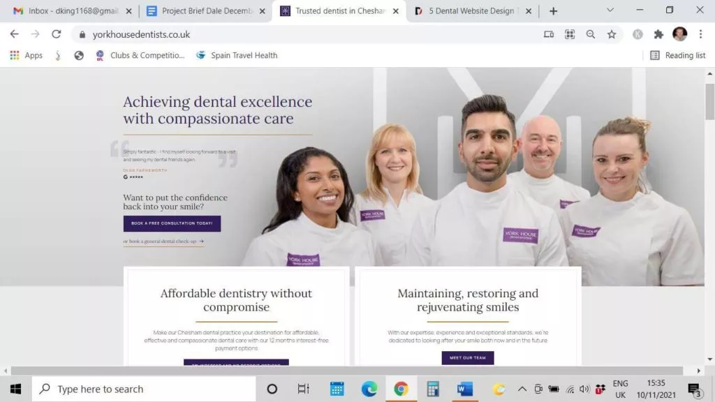
Here’s an example of just that.
https://www.yorkhousedentists.co.uk
If you look at this dental website design, it comes across as well organised and simplistic. It’s laid out in simple blocks, and this continues as you go down the page. It’s neat, concise, and it works. Visitors to the site aren’t going to become confused, and a central ‘book a free consultation’ button lets you know the exact steps to take. This is organised simplicity at its best.
#2 – Easy on the eye
Being easy on the eye doesn’t necessarily mean that you need to use muted pastels. Sometimes to many wishy-washy colours can make a website feel – dare I say it – bland!
On the contrary, some of the best dental website designs utilise bold colours
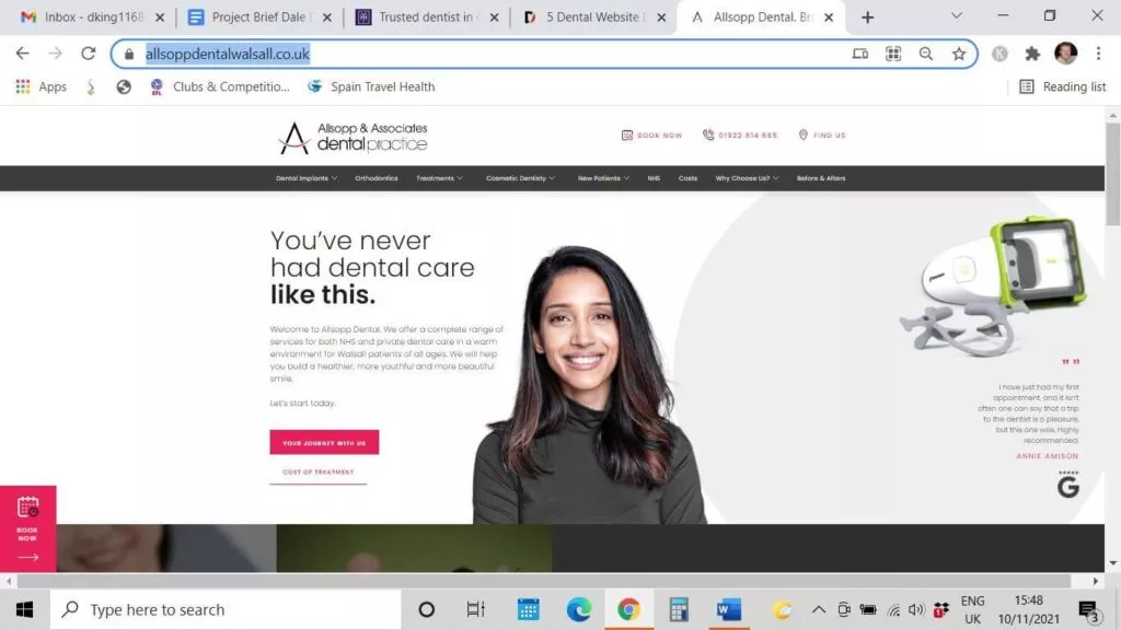
https://www.allsoppdentalwalsall.co.uk
Notice how the use of black and accent colours of shocking pink makes this website pop that against a white background works. Who says that dental websites need to be fifty shades of blue!
#3 – Simple navigation
The best dental websites don’t just look great; they need to function well as well. Remember, it’s all about the user experience (UX). In other words, they are helping people to find the information they need quickly and simply.
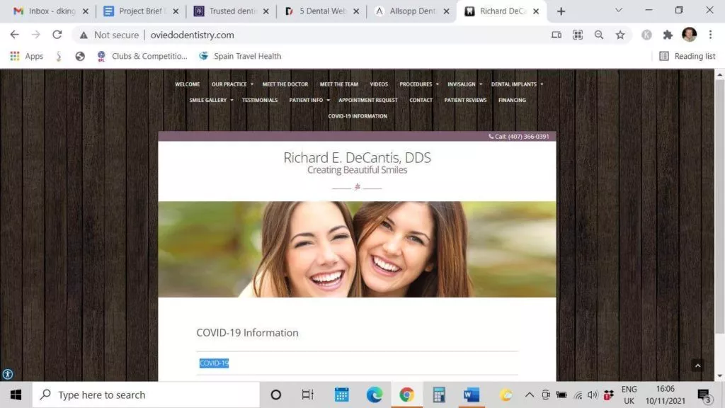
This dental website design does exactly that
http://www.oviedodentistry.com
Do you notice that while the website itself is simplistic, the visitor is left with no doubt where they need to go to access the information they need? All buttons stand out, and the content is sorted into appropriate pages. As a result, finding the information you need is a walk in the park.
#4 – Make it welcoming
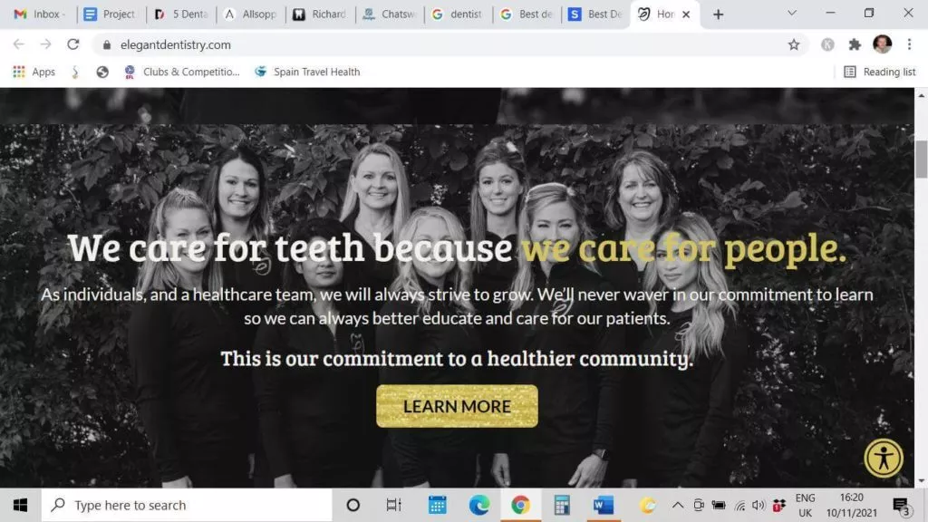
There’s nothing that says warm and friendly like a smile – and as dentists, it makes absolute sense to incorporate yours front and centre into your dental website design. Here’s a perfect example of how that works from this Ohio dentist.
https://www.elegantdentistry.com
Some dental website designs don’t have to be complex to work. Notice how the background here is very muted, letting the gorgeous smiles of the dentist and her team stand out. And, if their welcoming smiles aren’t confirmation enough of how trusting they appear to be, the slogan ‘We care for teeth because we care for people’ helps hit the message home. Simplistic perfection, don’t you think?
#5 – Don’t just say it; prove it!
Of course, one of the purposes of dental websites is to extoll the virtues of your dental practice and the team. However, it’s one thing to say that you provide outstanding patient-centred care but if you can prove it, even better!
There’s no better way of doing that than incorporating testimonials.
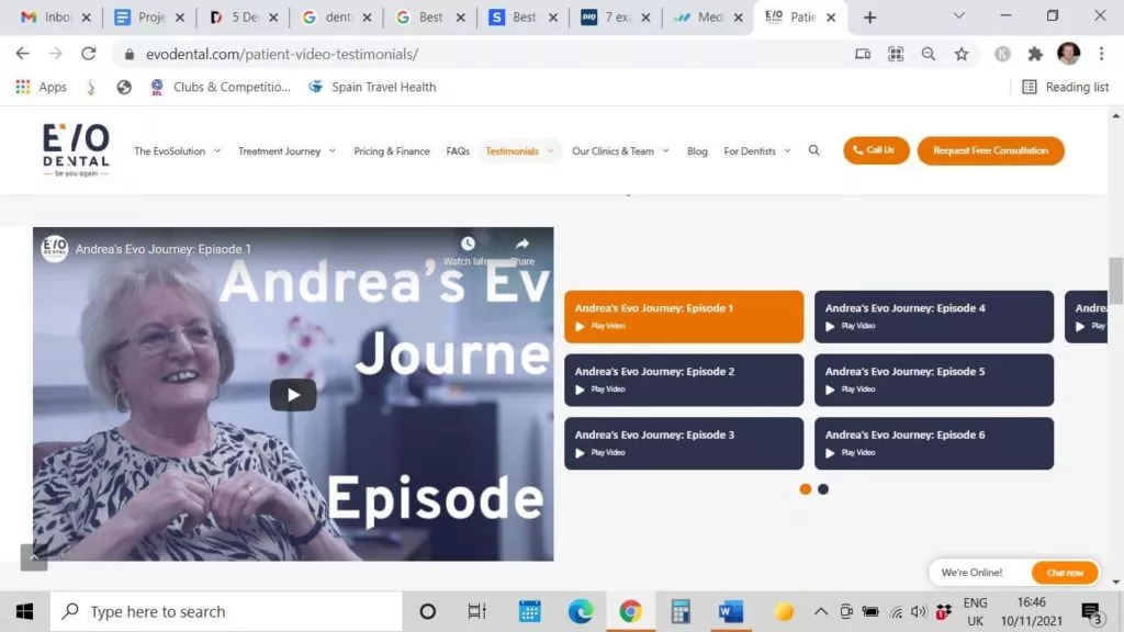
Here’s an example of how a dentist uses testimonials to support their excellent service here.
https://evodental.com/patient-video-testimonials
As you can see, this dental company mixes written testimonials with video testimonials. Here you can follow Andrea’s journey across seven short videos to get the overall experience of what it’s like to be patient at this ground-breaking dental website.
So the question is – when it comes to best dental website designs, where should the testimonials go – directly on the home page or a dedicated testimonials page?
In truth, dental websites should aim for both. Anyone visiting a dental website for the first time may need reassurance that the treatment or service they need is likely to be gentle and effective if they book at your dental practice.
So, you may consider opting for one or two testimonials on the home page, with a link to further testimonials on a dedicated page.
So there you have it. Now we’ve given you a glimpse at what elements make up some of the best dental website designs, it’s only fitting to talk about what you shouldn’t do.
Here are some absolute no’s of dental website design.
How not to present dental websites?
#1 – Dumping all your info on the home page
Please, don’t do this – ever!
We’ve spent the last 5 minutes or so talking about how the best dental websites are simplistic, organised and user-friendly. Giving people information overload right from the start is a sure-fire way of getting them to click off quicker than you can say ‘osseointegration’.
Aside from that, too much information can make a site look cluttered, and by default – less credible than one that has organised text components set amongst ample white space.
#2 – Letting a site stagnate
The best dental website designs all have one thing in common: constantly updating, evolving, and adding content.
Design trends change, and what was yesterday’s ‘wow’ is today’s old hat. Forbes, for instance, state that the average lifespan of a website is just 2 years and 7 months
Not only that, search engines like Google love great content and will reward dental sites which continually add engaging and share-worthy content. So make your dental website design work for you, and don’t let it stagnate.
#3 – Lack of contact details
You would think that putting contact details on dental websites is a given. Yet you’d be amazed at how many dental practices fail to put contact details where they can easily be seen. The best dental website designs incorporate contact details – either a phone number, email or both on every page. Many will also include a ‘book a consultation’ or appointment button too.
Hopefully, you’ve enjoyed this journey through some of the best designs for dental websites and why it matters.
If your dental website is somewhat lacking or isn’t pulling in new leads, talk to the team at Mediboost. We’re Australia’s #1 patient growth agency and can help you with every aspect of your dental website design and marketing to increase your patient footfall.
Need to talk? Contact us on 1300 163 058 or book a strategy meeting today.


